Enterprise Content
Management Suite
Case Study
Enterprise Content Management system UX / UI Overhaul
ROLEs / CORE TEAM
My Role: Lead UX / UI Design
2 lead UX designers,
2 - 4 Senior UX designer,
3 Senior Visual Designers
1 Lead UX Researcher
4 Senior Product Managers,
1 Software Architect
TOOLS
Figma, Axure RP, Adobe XD, Adobe Muse, Adobe Illustrator, Adobe Photoshop, HTML5-jQuery, MS Excel, Sketching, Paper Prototyping, Brainstorming sessions…
DELIVERABLES
UI Interaction Design Specifications
UI Visual Design Specifications
UI Accessibility Specification
User Research / SUS Reports
Hi-Fi Prototypes
Introduction
What is Enterprise Content Management?
Offers secure, audited, enterprise-wide control over any type of content, from documents, contracts, and engineering drawings to system reports, emails, images, and data-based business objects. Provides users with quick access to reliable information using robust metadata. Eases document processing for both administrators and end-users with built-in filtered search, content viewing, and workflows. ECM Functional areas: Sales, HR, Legal, R&D, Asset Management, Maintenance, etc... The ECM Suite is can be integrated with external business applications such as Oracle, SAP, PeopleSoft, etc...
Constraints
Only the Front-End can change. We can request less expensive changes to the Back-End capabilities if it's a must. Keep original, core UI patterns (if there are any...) and views familiar to ECM users. -Not a hard requirement.
The Underlying Problem
ECM is one of the most established Enterprise Content Management system in the world. However, the design was increasingly outdated when compared to its competitors, and the overall user experience, usability fell short of expectations.
The product wasn’t design with in users in mind to begin with...
There was a real chance that customers were about to leave.
An in-depth UX / UI overhaul felt long overdue to ensure that ECM can remain one of the lead solution on the market in the long run.
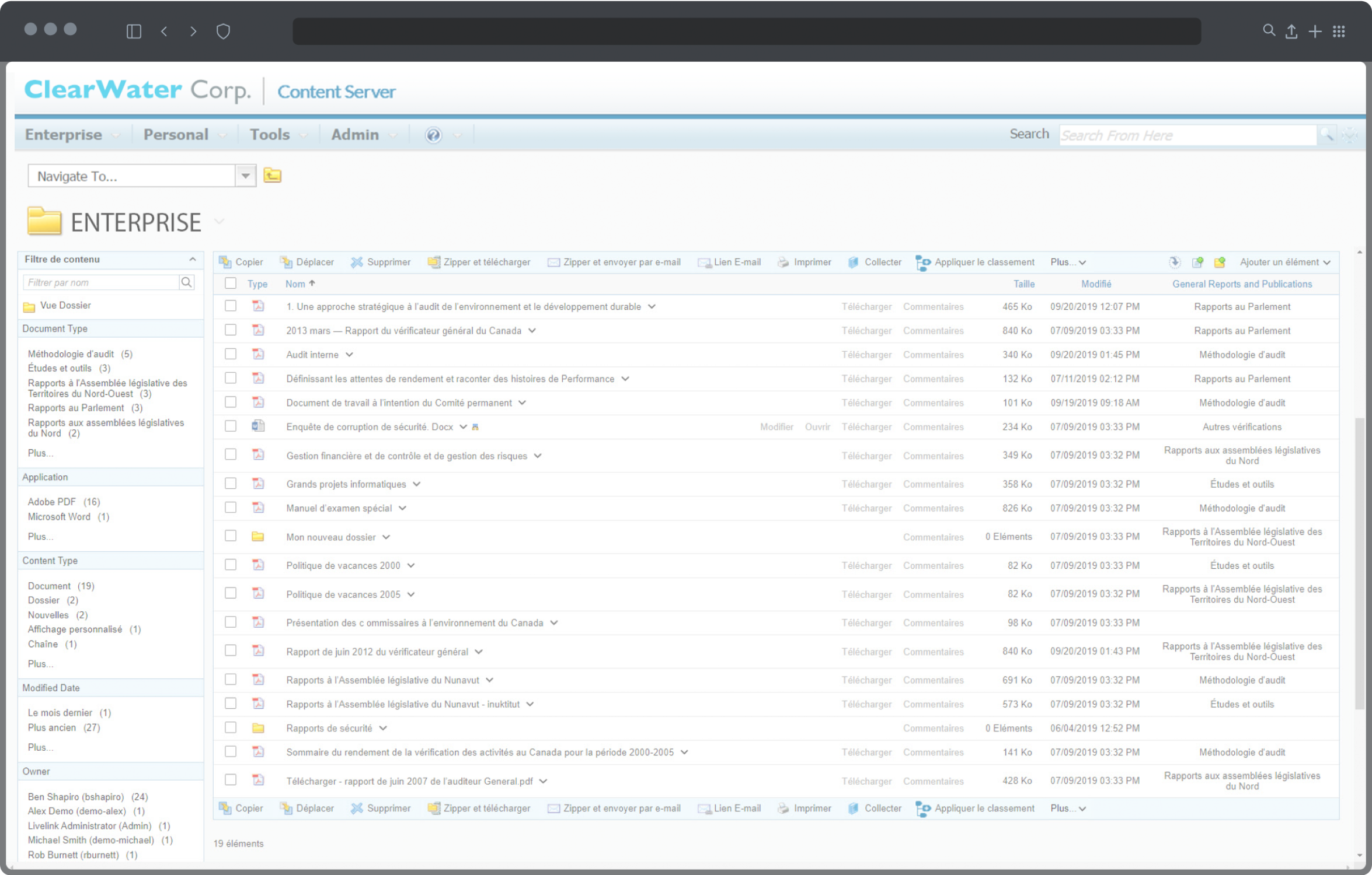
"Content Server's UI suffered from “hard to get content,” having busy pages, too many clicks to complete simple actions and too many page post-backs... Not working on Mobile platforms.“
Original Content Server User Interface
Leveraging the earlier usability studies, interviews, and analysing those findings to get the whole picture...
• Partnership with customers – ongoing feedback to a product or a product features
• Customer visits – contextual inquiries, shadowing, user interviews
• Ongoing – system usability testing, customer and user feedbacks
Key Findings
Content consumers:
“Didn’t want to hang out in ECM space! Just want to get in and out.”
Content creators, analysts:
Overall too much time is spent to perform even simple tasks.
High information density on all screens.
Unclear, uniform UI for distinct areas and features.
Hard to understand, inconsistent UI patterns, cumbersome, slow interactions.
Unclear UI feedbacks, obscured operability. Etc...
Unnecessary time spent by users in the system due to:
Specific Issues:
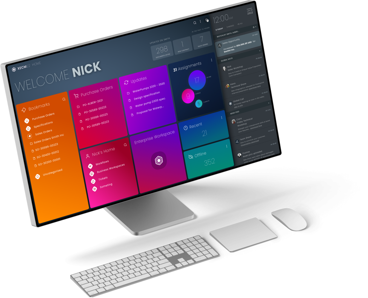
No functional User Home Entry point (after logging in) or a landing area, where relevant information and updates can be found.
List View or Table (to display the list of files, line items) wasn't performant and it was heavy-handed.
Metadata, Audit Trail, Separate data entry UI from viewing data. Hard to get to, painful to check metadata across different files.
Search / Filter, Components were static and inefficient slow to use.
Sharing and Collaboration, It was powerful but hard to use and too generic, impossible to grant permission easily.
Messaging and System Notifications were cluttered, unfriendly, unclear.
There were no differentiated UI layouts for distinct system locations or business objects.
Workflows and workflow tracking UIs. Rigid, cumbersome usability. Complicated layout. Unclear presentation of information.
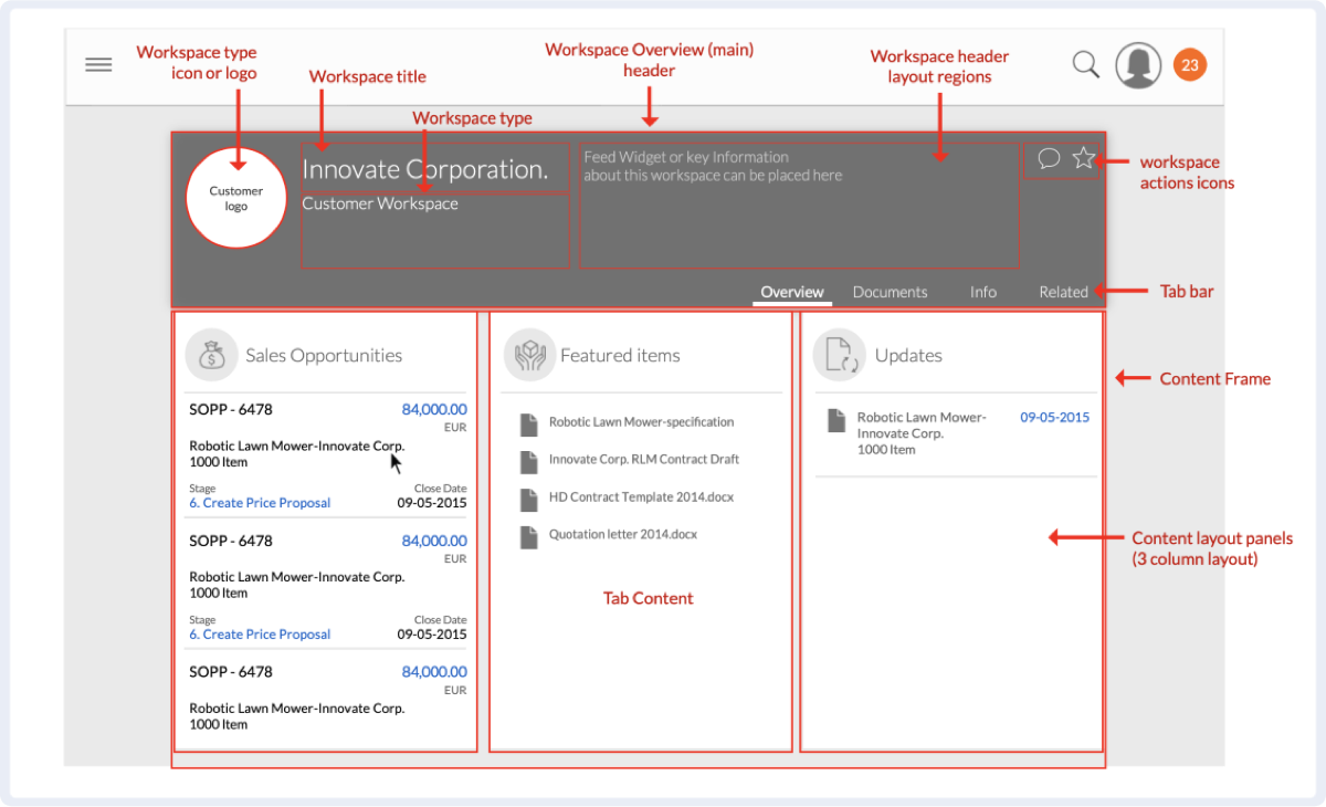
Business Workspace UI (BW consists of heavy metadata, documents, team, related business objects)
Case management workspaces, Employee file management, Customers, Products, Purchase Orders, Sales orders, etc...
Social features, Some just partially implemented or gimmicky features
Evaluating the Product
We have studied how the current application works, How users work with it in typical, frequently repeated use-case scenarios.
Studied the documentation, Tested how and what typical operations can be performed.
Heuristics of the legacy Interface. It’s usability
based on User and Client research results
How many of these qualities below are true to the legacy application?
Heuristic Evaluation of the
Legacy ECM UI and its Usability
NO / 3 - Findable: Able to be located
NO / 1 - Accessible: Easily approached and/or entered
NO / 4 - Clear: Easily Perceptible
NO / 2 - Communicative: Talkative, informing, timely
YES / 7 - Useful: Capable of producing the desired or intended result
YES / 8 - Credible: Worthy of confidence, reliable
YES / 9 - Valuable: Of great use, service, and importance
NO / 4 - Learnable: To fix in the mind, in the memory
NO / 0 - Delightful: Greatly pleasing
(When scoring features on a scale from 1 to 10. Where NO is less than 5. / Yes is 5 or greater than 5 )
Solution & Design Opportunities
We set out to completely overhaul ECM's User Experience, the core usability, user interaction, UI layout patterns, and the look and feel.
We have created a unifying design system that merges best-in-class usability and aesthetics across all corners. (On average, above 83 SUS)
These changes impacted every aspect of the ECM UI. Its most important benefit was, our users were able to perform their daily work a lot more efficiently.
"Relevant: Role-Based content on users' fingertips. Clean, Efficient: Progressive-Disclosure. Intuitive: Informative visual language and layout patterns."
Goals
First focus only on the useful, essential features and functionalities, to enable 80% of users to work more efficiently.
Design an aesthetic, highly efficient, intuitive product to increase user satisfaction and to reverse decreasing customer conversion.
Build to Last UI! - So never have to fully overhaul it again.
Bring content to the users, don't make users hunt for it. Enable users to populate, curate their content - User Home / Meaningful update feed.
Reduce complexity - increase efficiency and productivity - Implement a Roles-Based UI / Progressive Disclosure / Streamlined Interactions.
Consistent UI structure - Establish a coherent UI layout structure and a UI pattern library.
Aesthetic, Modern, Clear: Functional, establishing visual language, Gestalt Principles, Analysis of forward-looking, visual design trends.
Increase utility, cover all the “On the go” use cases. - Cross-Platform Adaptive / Responsive UI.
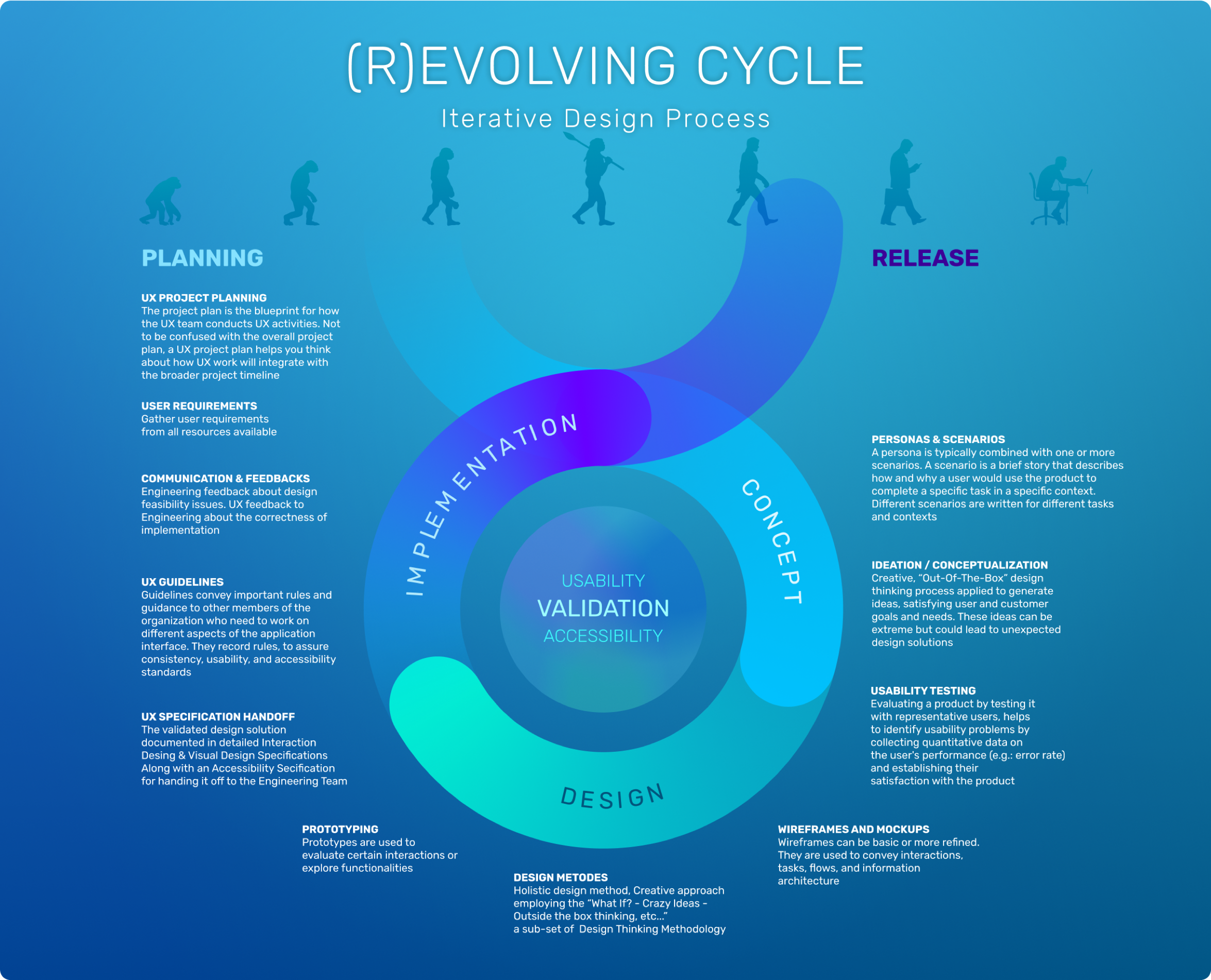
UX Design Activities
Interaction Design
Understanding USER NEEDS and USER GOALS
Defining personas / Creating user stories
Analysing – synthesising the information
UX / iX Design concept
(what if? / crazy ideas / think outside of the box)
Concept refinement - Prototype - Validation
Detailed UI Interaction design specification
Visual Design
UI Specification hand-off to Visual Design
VISUAL DESIGN CONCEPT
Design Specification hand-off to Development
Review implementation for correctness
Validation - Usability Testing - Feedback
Design Principles


Intuitive
Efficient
Streamlined
Delightful
Adaptable
Intuitive / Efficient / Cross-Platform
People are grateful when we don't waste their time and provide an efficient tool they can get their work done quickly.
Make it easy for business users to work with content from whichever device or system is most efficient for their needs.
Core Principles
Extended Principles
Personas


Thomas
Asset Maintenance Technician
Content Consumer
Catherine
Senior Technical Writer
Contributor
Nicolas
Sales Director
Manager, Contributor
Clara
HR Representative
Content Consumer
Alexandra
Knowledge Manager
Admin, Contributor
Users types:
Consumers vs Creators, Curators
Frequent vs. Casual vs. Infrequent users.
Skilled and Unskilled users.
Technical vs. non-technical users
Content consumers didn’t want to hang out in ECM space! Just get in and out.
Content creators, curators, and analysts who must spend time working there should have the right tools, easy-to-use metadata forms, and list views, tools to search / filter, share, move, receive, and launch workflows. etc...
Based on our research, we have defined a set of key personas (majority of typical users) covering approximately 80% of our audience.
After the personas' goals, needs, and typical activities were identified, we have compiled a set of user roles based on our personas.
Personas / Roles
Tom: Asset Maintenance Technician / Consumer
Catherine: Senior technical writer / Contributor
Nicolas: Sales Director / Manager, Contributor
Clara: HR representative / Consumer
Alexandra: Knowledge Manager / Administrator, Contributor
Thomas
Asset Maintenance Technician
Mental Model
Technology
Goals, Motivations, and Needs
Key Scenarios
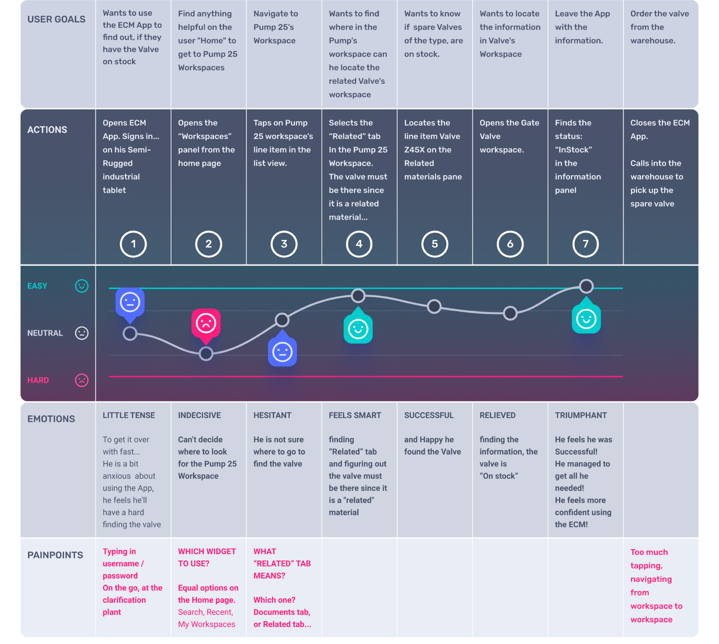
User Journey & User Flow Example
User Journeys / User Flows / Use Cases were created, based on observing real-life users (in different roles) working with the system, during contextual inquiries. Consolidating many observed, recorded flows, we have narrowed them down to a set of representative ones.
User Journey Map #03
TOM / Asset Maintenance Technician, 28 yo
Scenario
He arrives at the clarification plant in the morning. He just received a Maintenance Order to replace a Gate Valve on Pump 25. located at Pump Station #7.
Tom is a new employee, just started to work at ClearWater Corporation. ClearWater runs water clarification plants in the region. Tom got just basic training, he rarely uses the ECM App.
Tom is well versed in Social Media Apps (FB, YouTube) but he is a novice ECM user. He doesn’t know it well enough.
All he knows, it is complicated and large software.
Whenever he uses ECM, he just gets what he needs and leaves.
Goals / Expectation
Tom just wants to go get the information and do his "real" work...
Tom wants to know if he has a spare Valve on stock in the warehouse or he needs to order one.
He has to find the valve's workspace (bill of material) in the ECM system to get that information.
Painpoints
Tom has some fears about using the ECM App. He fears he does something wrong while poking around.
Also, he is anxious, he'll get lost in the system, spending too much time, hunting down what he needs.
User Flow #03
User Journeys / User Flows / Use Cases were created, based on observing real-life users (in different roles) working with the system, during contextual inquiries. Consolidating many observed, recorded flows, we have narrowed them down to a set of representative ones.
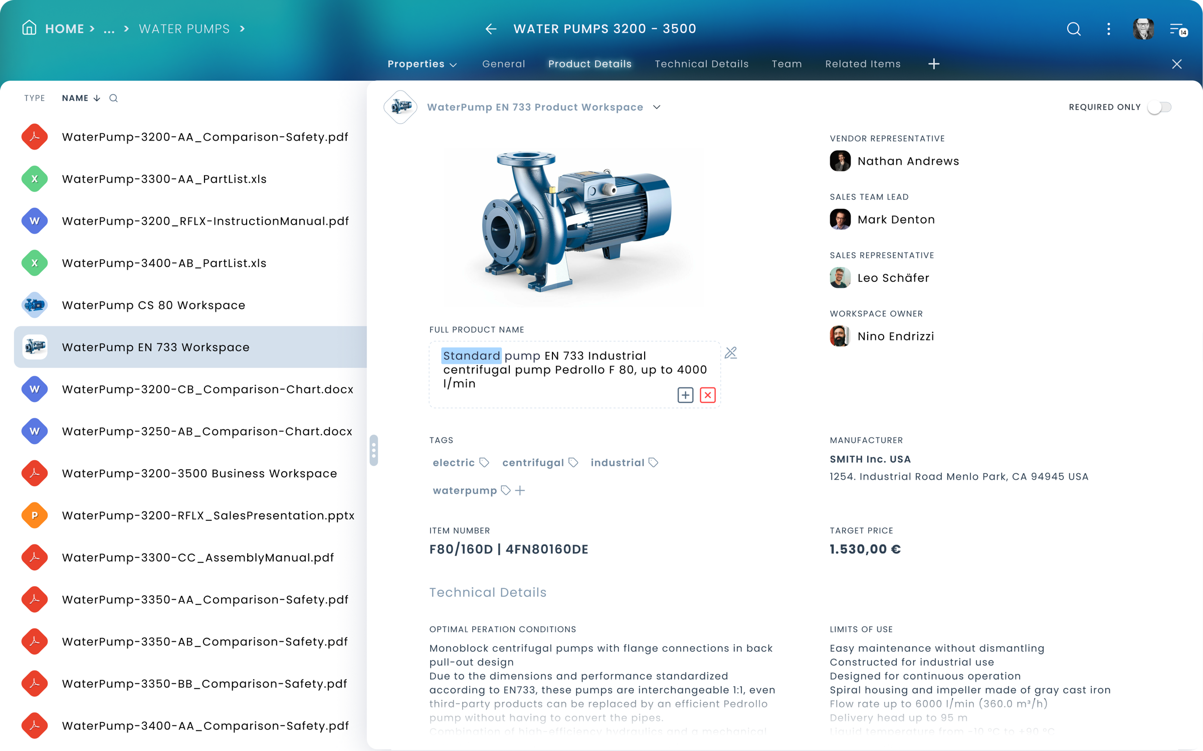
Tom is a technician. He works for ClearWater Corp. He arrives at the clarification plant in the morning. Tom just received a Maintenance Order to replace a faulty Gate Valve on Pump 25. It is located at Pump Station #7. He needs to look up the part list (bill of material) for the valve to find out if he has it in stock or needs to order it...
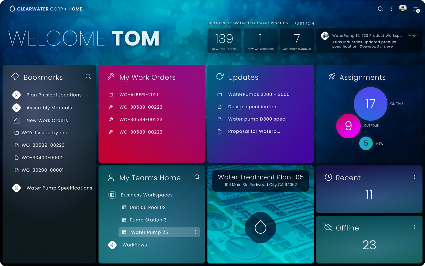
01. After signing in to ECM App, he looks for the My Team’s Home panel.
02. On his home page, he looks for
Pump 25 in the team's Workspaces panel.
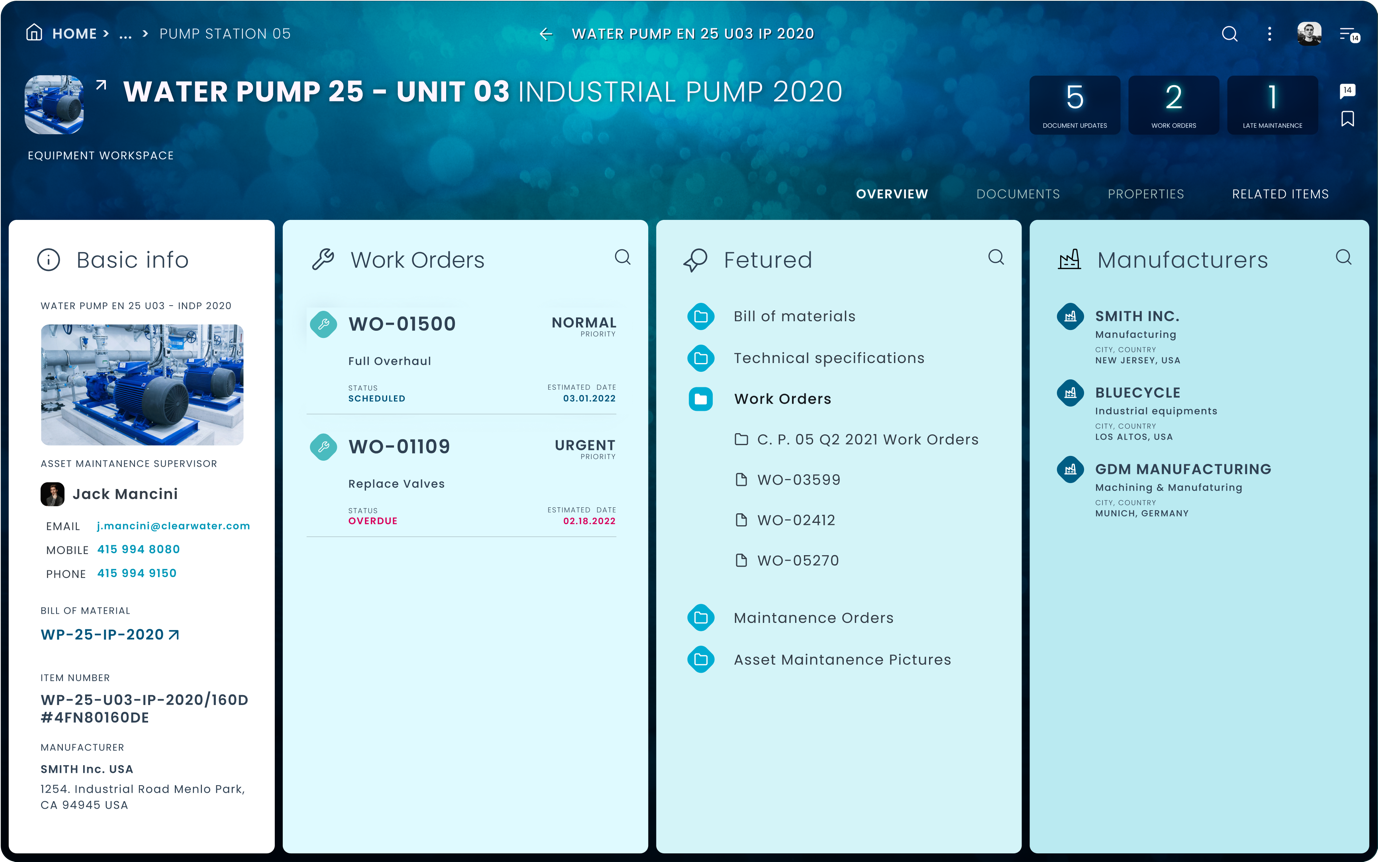
03. He clicks on the workspace Pump 25 line item in the panel.
04. The Pump 25 business workspace opens.
05. He selects the “Related” Tab
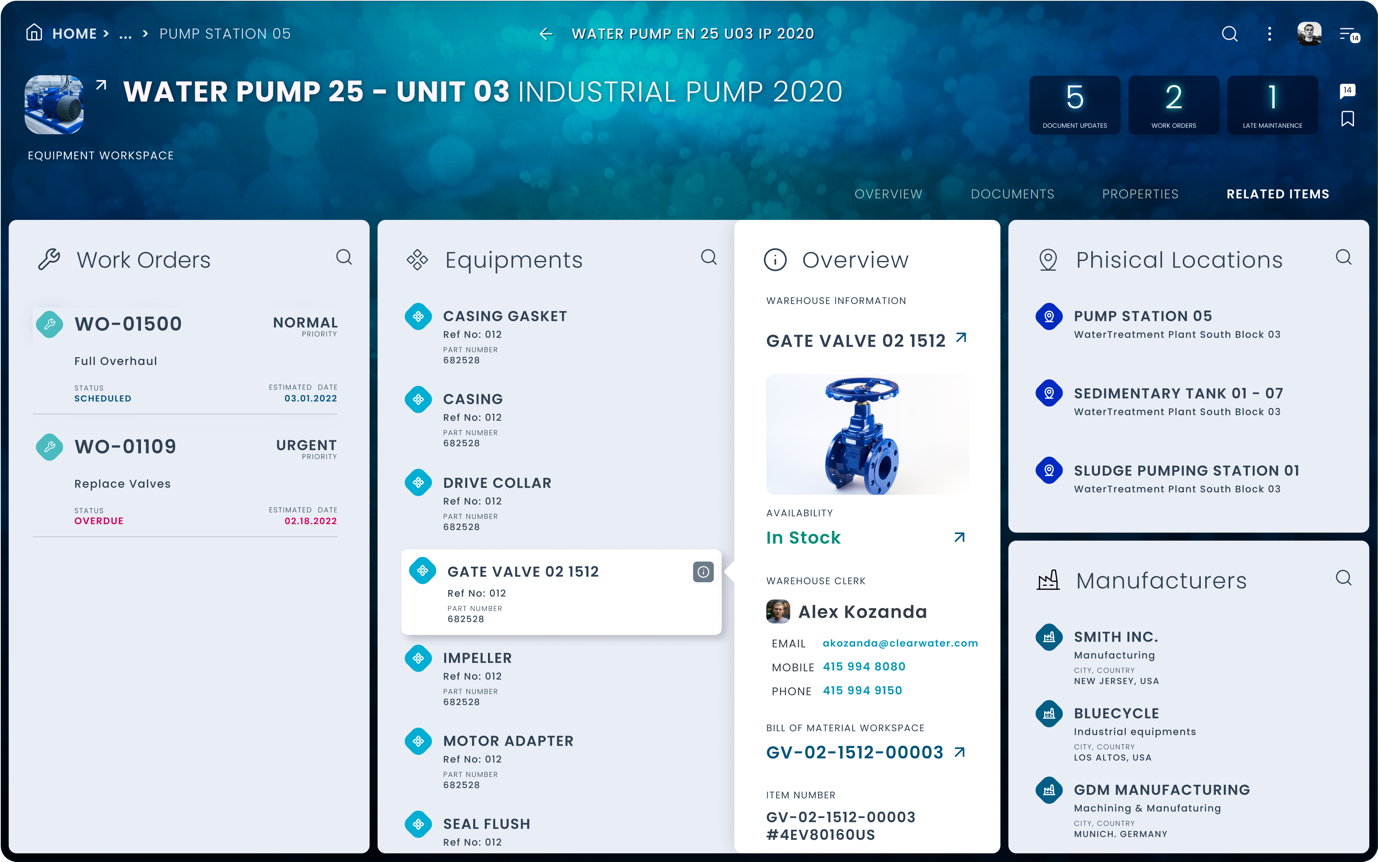
06. In the Equipment list, he looks for the “Gate Valve”. He clicks on the “i” icon after the name. The quick overview panel opens.
07. In the Information panel he finds all necessary information about the replacement item, as well as the Availability status: In Stock.
Tom just calls in to the warehouse to order the new part.
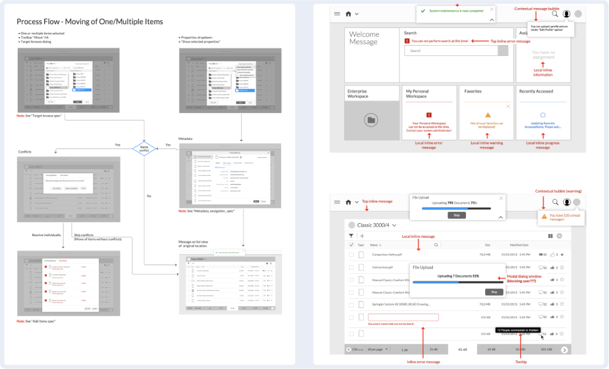
Concepts, Wireframes
Examples show wireframes enabling UX/ iX designers to quickly iterate through design solutions, focusing on interaction design and layout patterns only. Communicating user-flows, behaviour, and structure to visual designers and engineers or visualising proof-of-concept design variations.
Wireframes are not meant to be presented to clients or stakeholders!
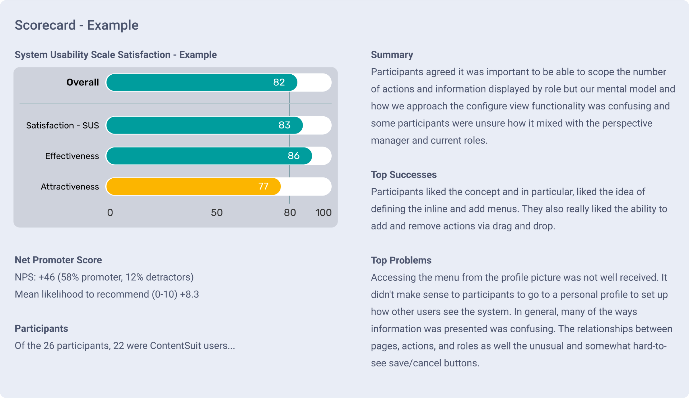
Validation / Testing, SUS Example
All key components of the product were usability tested at the conceptual design and the early implementation phases to make sure the product will perform as intended after release. Tests scripts were compiled from essential, real-life operations, frequently performed by end-users.
The example below shows the test result of an early conceptual design before any iteration or refinements are applied.
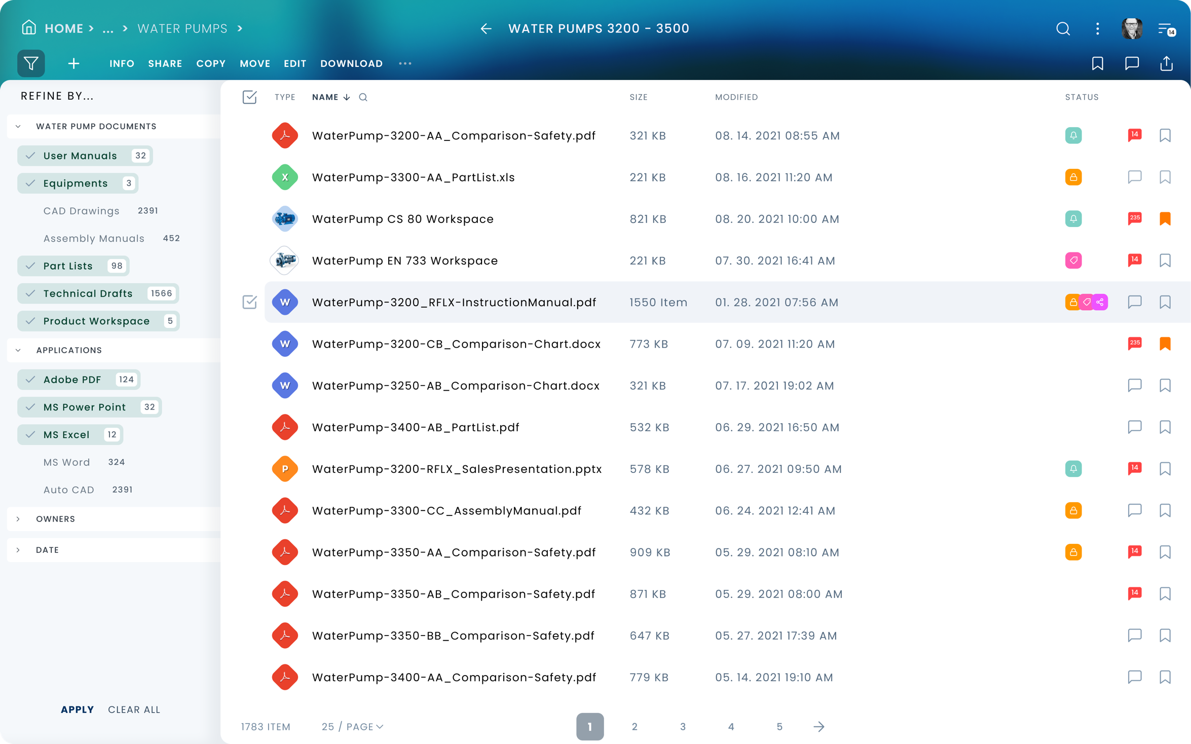
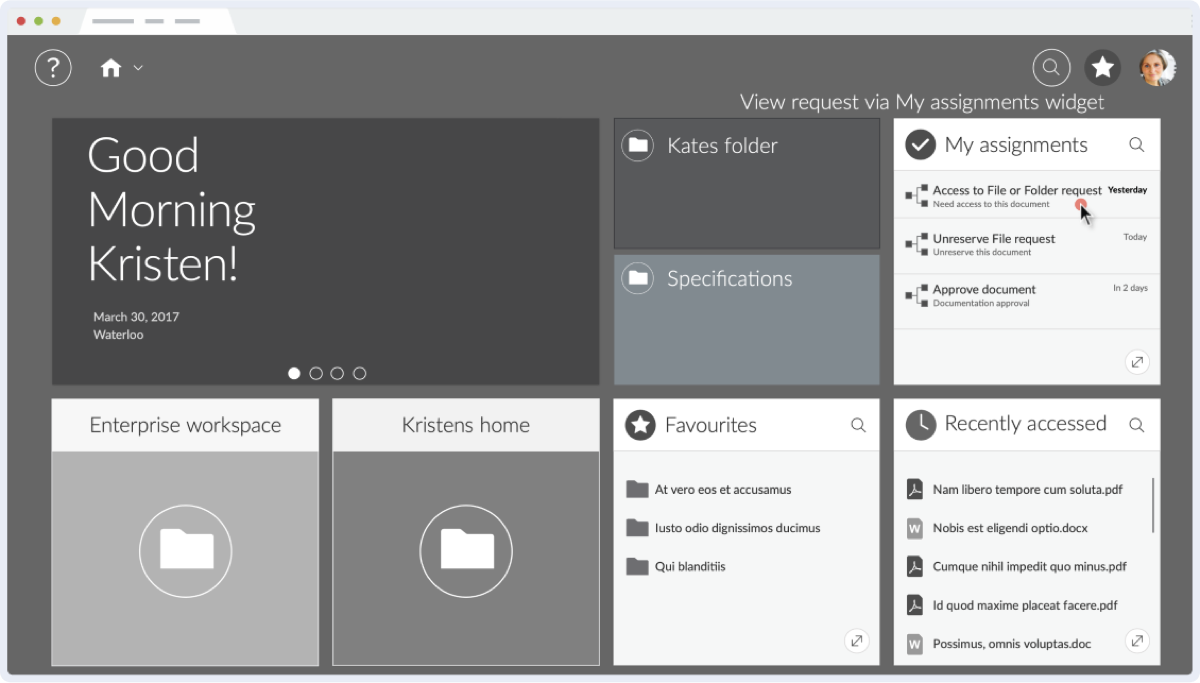
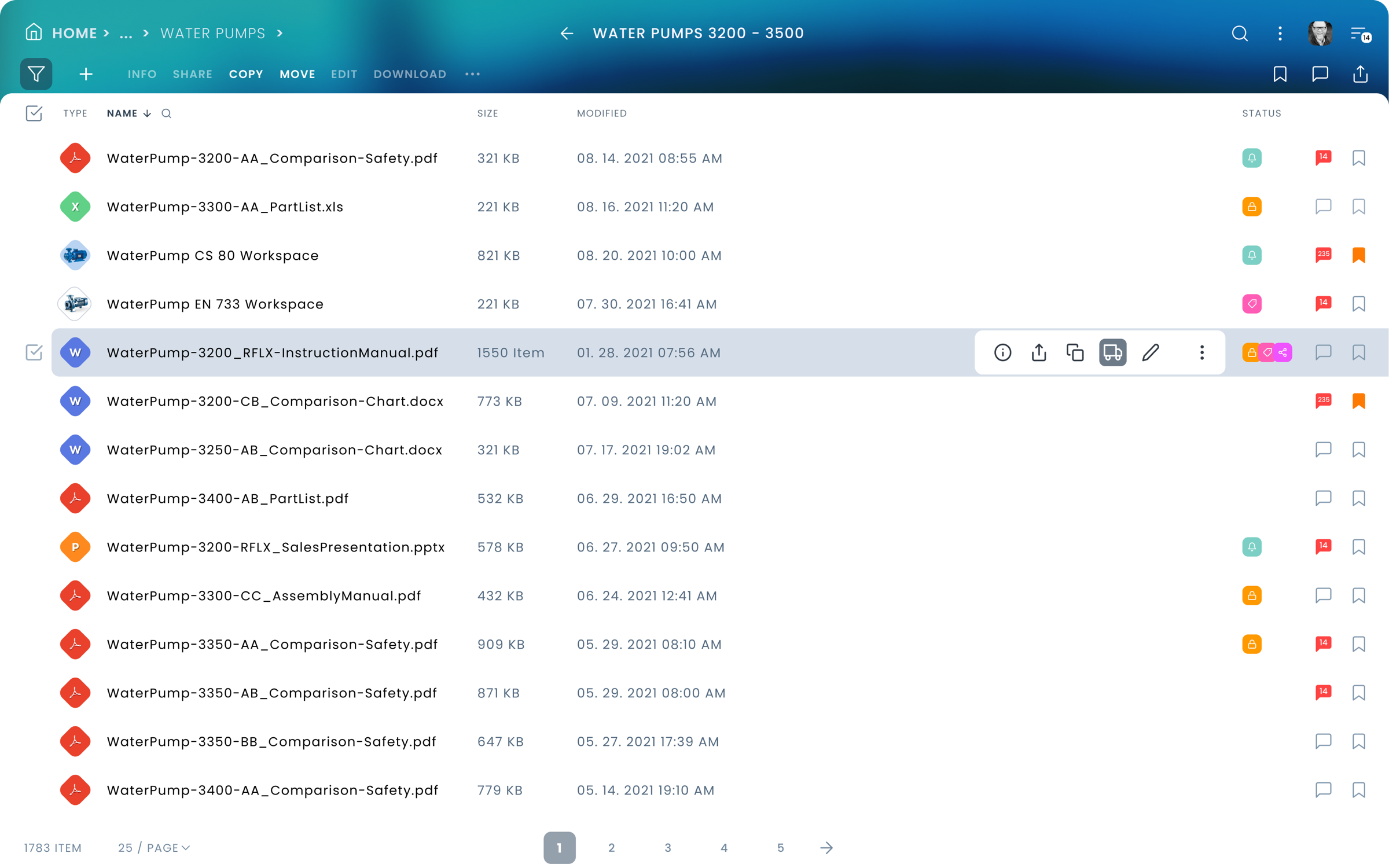
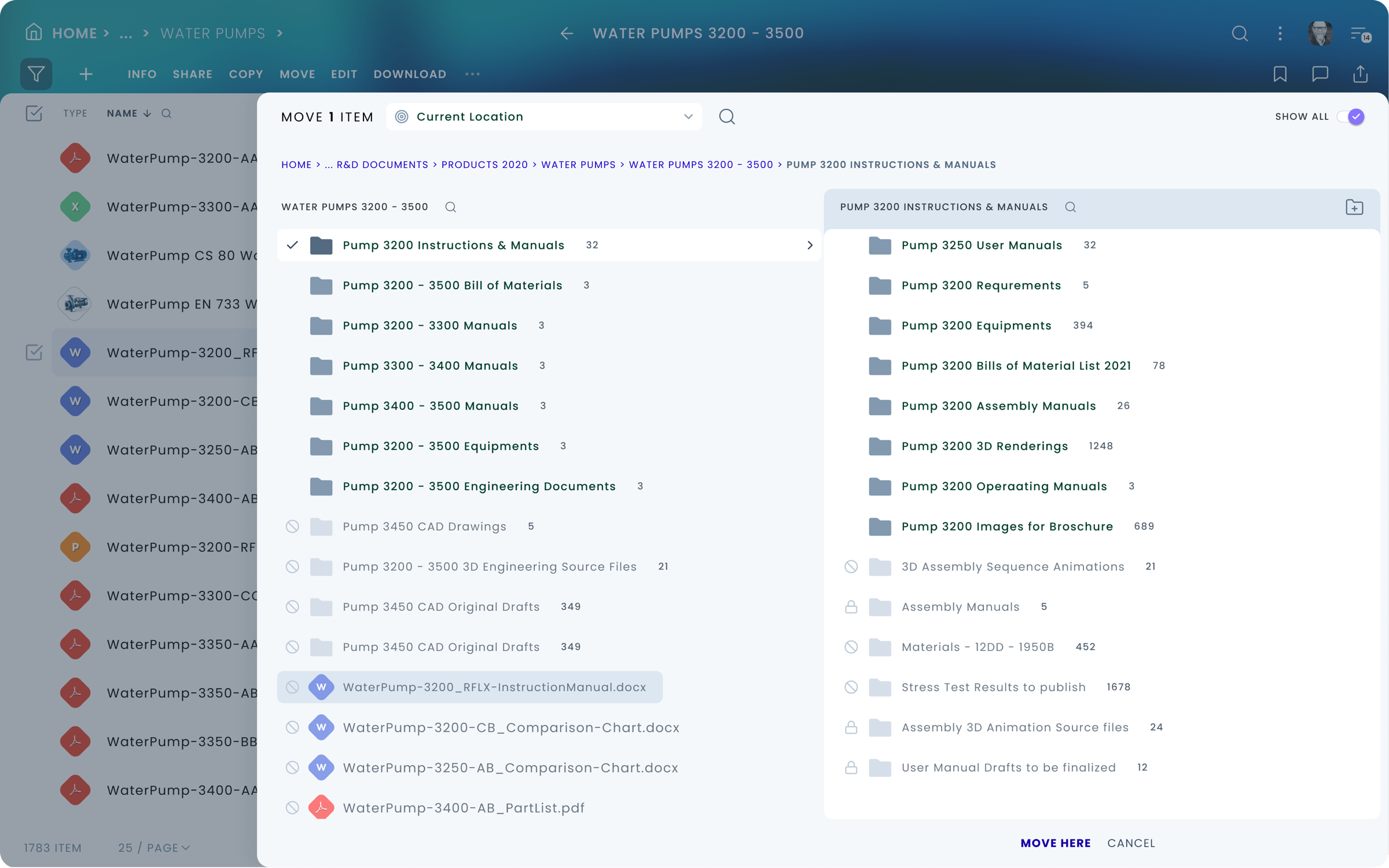
CS / XECM UI Screen Examples
Visual design was updated relative to original

Quotes from the audience
by General Networks / on November 18, 2015
The Unexpected at OpenText Enterprise World 2015
It’s all about adoption
As of Content Suite version 10.5, Content Server's UI suffered from having a busy page, too many clicks to complete simple actions, and too many page post-backs (waiting for the page to reload after a button click).
There’s a new Content Server user interface – new, 4B536C, with an almost intuitive UI for OpenText Content Management Suite. This is an evolutionary leap toward better user adoption.
OpenText CEO Mark Barrenechea said in the keynote address that Suite 16 is as easy to use as SharePoint. We disagree. Suite 16 is easier to use than SharePoint.
We have been waiting and watching the development of the new UI over the past two years, and have participated in the innovation lab in past Enterprise World events providing our feedback in the direction of increased user adoption.
In the new interface, it takes a single click to view all document metadata including category attributes. The new Perspectives feature allows configuring the role-based landing page that is designed to show the user's relevant data on a single page. Administrators can drag and drop the widgets on the page, including Recently Accessed, My Favorites, and My Assignments.
User Quotes
"Review of Livelink ECM 10 application"
Ease of use and administration of the suite
Simple, intuitive, and good looking interface
Versatile through use of the core product
"Next Generation Document Management System"
Previously, we were using SharePoint for document management but have now upgraded to OpenText ECM. While SharePoint provided basic functionality, OpenText has enhanced our records management capability. The ability to customize workflow is vastly improved to match our complex processes.
Review collected by and hosted on G2.com.
"Reliable with friendly user interface"
It is stable reliable and has an interface that's very user friendly and easy to use
"ECM "
User friendly and makes job easier by having Various options available
"OT Content Server 10"
...Workflow is the next coolest thing been using them for the last 20 years and they are extremely stable.
"Easy to use, quick to learn, and intuitive."
My experience with the OpenText Web Content Management and Records Management is that both applications were intuitive and very easy to use and learn even if no formal training was provided.
Challenges
Learning and understanding the domain
Reducing complexity - Understand complex processes, features, back-end specific logic
Filtering out self-serving features from real, useful ones
Convincing Stakeholders to BUY In
Internal resistance to new solutions, from unexpected places...
Failure of bringing some key stakeholders on board
Unnecessary Rework of design Solutions, over and over...
Wasting time and resources. Subjective judgment calls, decisions not based on best practices nor test results.
Inexperience in A large scale project
Several of the staff have never been involved in a large-scale UX / UI overhaul project.
In some cases, it resulted in a large amount of extra work and some conflicts.
Conclusion
success!
It was a first, as far as I know, there was no such overarching collaboration and
focused effort taking place before, at this company, to redesign the flagship products.
The product was very well received by end-users and customers alike!
The result has exceeded the customers' and users’ expectations.
There was an extraordinary collaboration between different disciplines, such as Product
Managers, UX Designers, Engineers, Software Architects, and senior leadership!
Thank You!

Copyright © 2022 Peter Budavari. All rights reserved.