Enterprise Content
Management Suite
UX / iX / UI
Project Overview
Enterprise Content Management Suite UX / UI Overhaul
ROLE
Full-time employee
Lead UX / iX / UI Design
TOOLS
Figma, Axure RP, Adobe XD, Adobe Muse, Adobe Illustrator, Adobe Photoshop, HTML5-jQuery, Sketching, Paper Prototyping, Brainstorming sessions…
DELIVERABLES
UI Interaction Design Specifications
UI Visual Design Specifications
UI Accessibility Specification
User Research
Hi-Fi Prototypes
Introduction
It would be unreasonable to list all key features designed for ECM below. So I only share some of those, I was closely involved with during this lengthy project.
Also, I have updated the visual design since the design process spanned multiple years. We also have designed this system to enable the customer to brand/customize and update the look&Feel, to begin with…
Enterprise Content Management offers secure, audited, enterprise-wide control over any type of content, from documents, contracts, and engineering drawings to system reports, emails, images, and data-based business objects. Provides users with quick access to reliable information using robust metadata. Eases document processing for both administrators and end-users with built-in filtered search, content viewing, and workflows. ECM Functional areas: Sales, HR, Legal, R&D, Asset Management, Maintenance, etc... The ECM Suite is can be integrated with external business applications such as Oracle, SAP, PeopleSoft, etc...
Constraints
Only the Front-End can change. We can request less expensive changes to the Back-End capabilities if it's a must. Keep original, core UI patterns (if there are any...) and views familiar to ECM users. -Not a hard requirement.
The Underlying Problem
Cumbersome Operation / High Information Density / Hard Access Content / Outdated Aesthetics
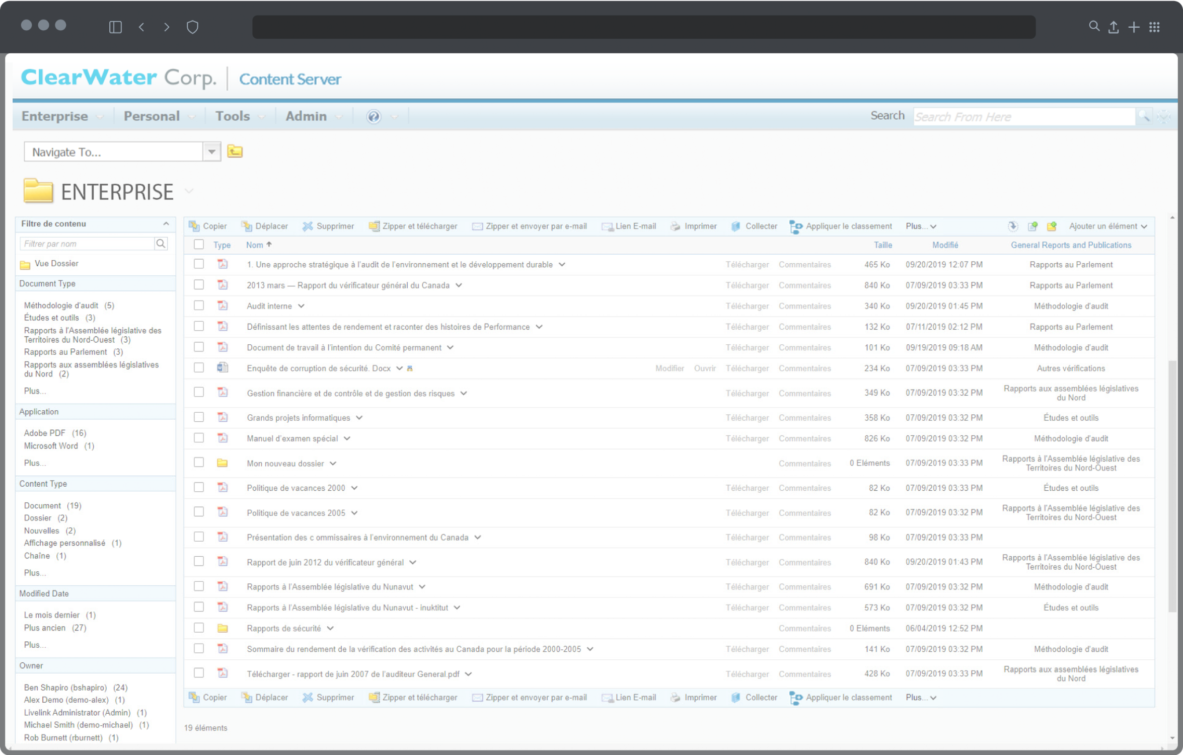
ECM is one of the most established Enterprise Content Management system in the world. However, the design was increasingly outdated when compared to its competitors, and the overall user experience, usability fell short of expectations.
The product wasn’t designed with users in mind, to begin with...
There was a real chance that customers were about to leave.
An in-depth UX / UI overhaul felt long overdue to ensure that ECM can remain one of the lead solution on the market in the long run.
"Content Server's UI suffered from “hard to get content,” having busy pages, too many clicks to complete simple actions and too many page post-backs... Not working on Mobile platforms.“
Bring the content to the user: Role based, Modular, Contextual, Streamlined…
Solution & Design Opportunities
We set out to completely overhaul ECM's User Experience, the core usability, user interaction, UI layout patterns, and the look and feel.
We have created a unifying design system that merges best-in-class usability and aesthetics across all corners. (On average, above 83 SUS)
These changes impacted every aspect of the ECM UI. Its most important benefit was, our users were able to perform their daily work a lot more efficiently.
"Relevant: Role-Based content on users' fingertips. Clean, Efficient: Progressive-Disclosure. Intuitive: Informative visual language and layout patterns."
Goals
First focus only on the useful, essential features and functionalities, to enable 80% of users to work more efficiently.
Design an aesthetic, highly efficient, intuitive product to increase user satisfaction and to reverse decreasing customer conversion.
Build to Last UI! - So never have to fully overhaul it again.
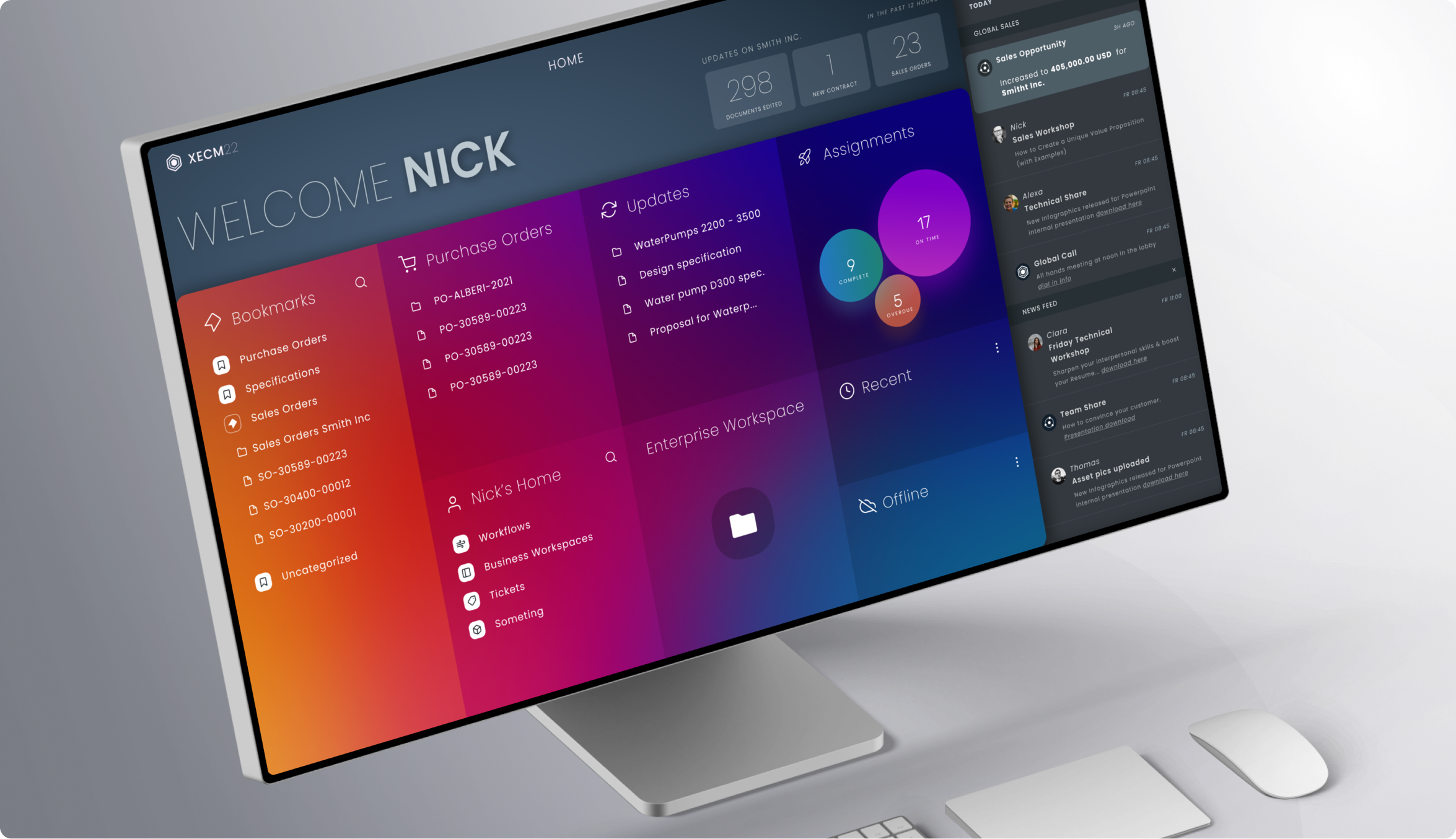
Bring content to the users, don't make users hunt for it. Enable users to populate, curate their content - User Home / Meaningful update feed.
Reduce complexity - increase efficiency and productivity - Implement a Roles-Based UI / Progressive Disclosure / Streamlined Interactions.
Consistent UI structure - Establish a coherent UI layout structure and a UI pattern library.
Aesthetic, Modern, Clear: Functional, establishing visual language, Gestalt Principles, Analysis of forward-looking, visual design trends.
Increase utility, cover all the “On the go” use cases. - Cross-Platform Adaptive / Responsive UI.
Cross Platform Responsive UI
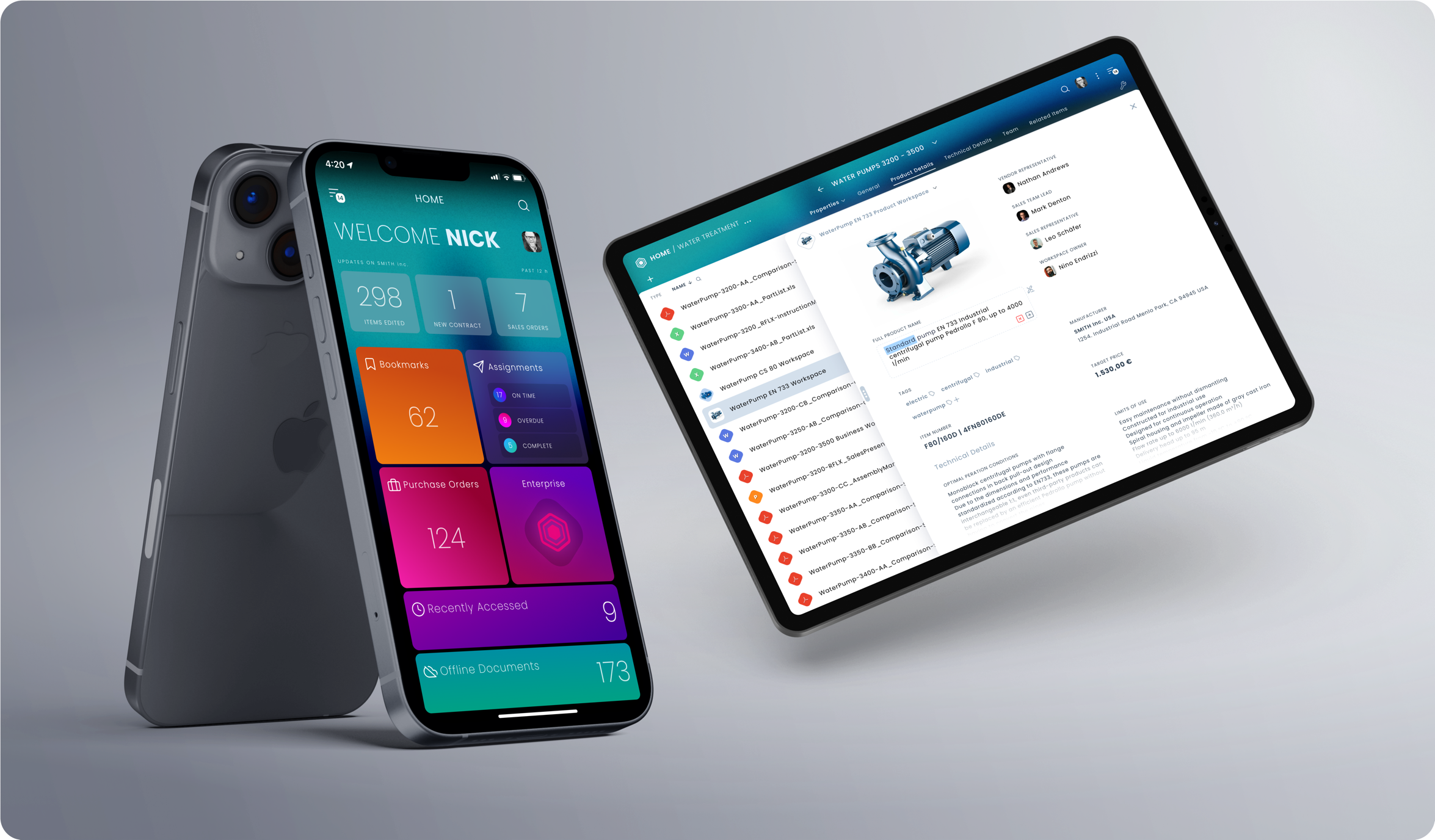
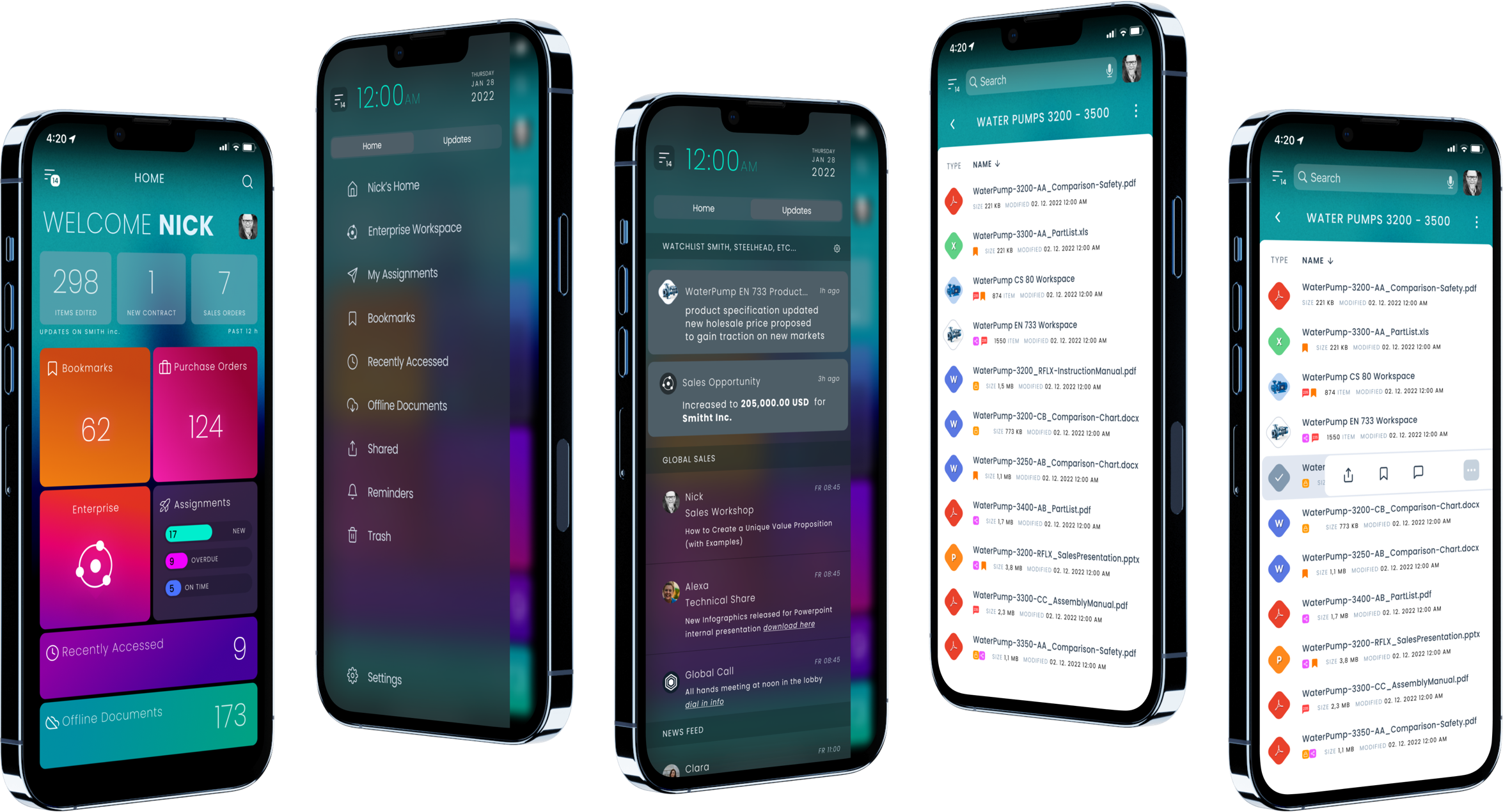
Enabling ECM to be accessed across multiple platforms
The Responsive / Modular UI structure, allows users to access ECM system from all platforms, from Large XHD screens and Laptops to Smart Phones…
Customizable / Role Based UI delivers the right content
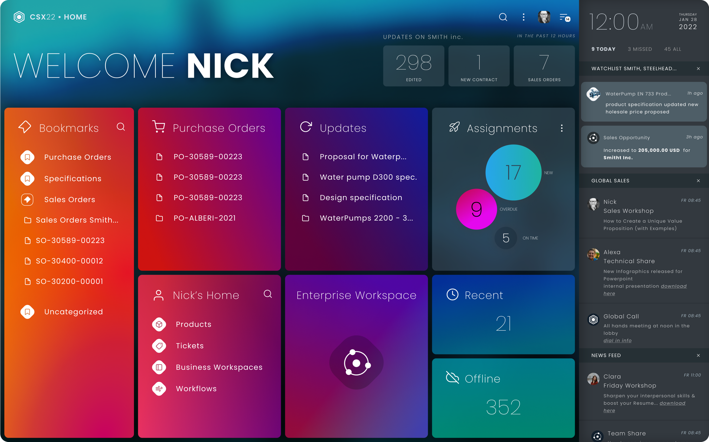
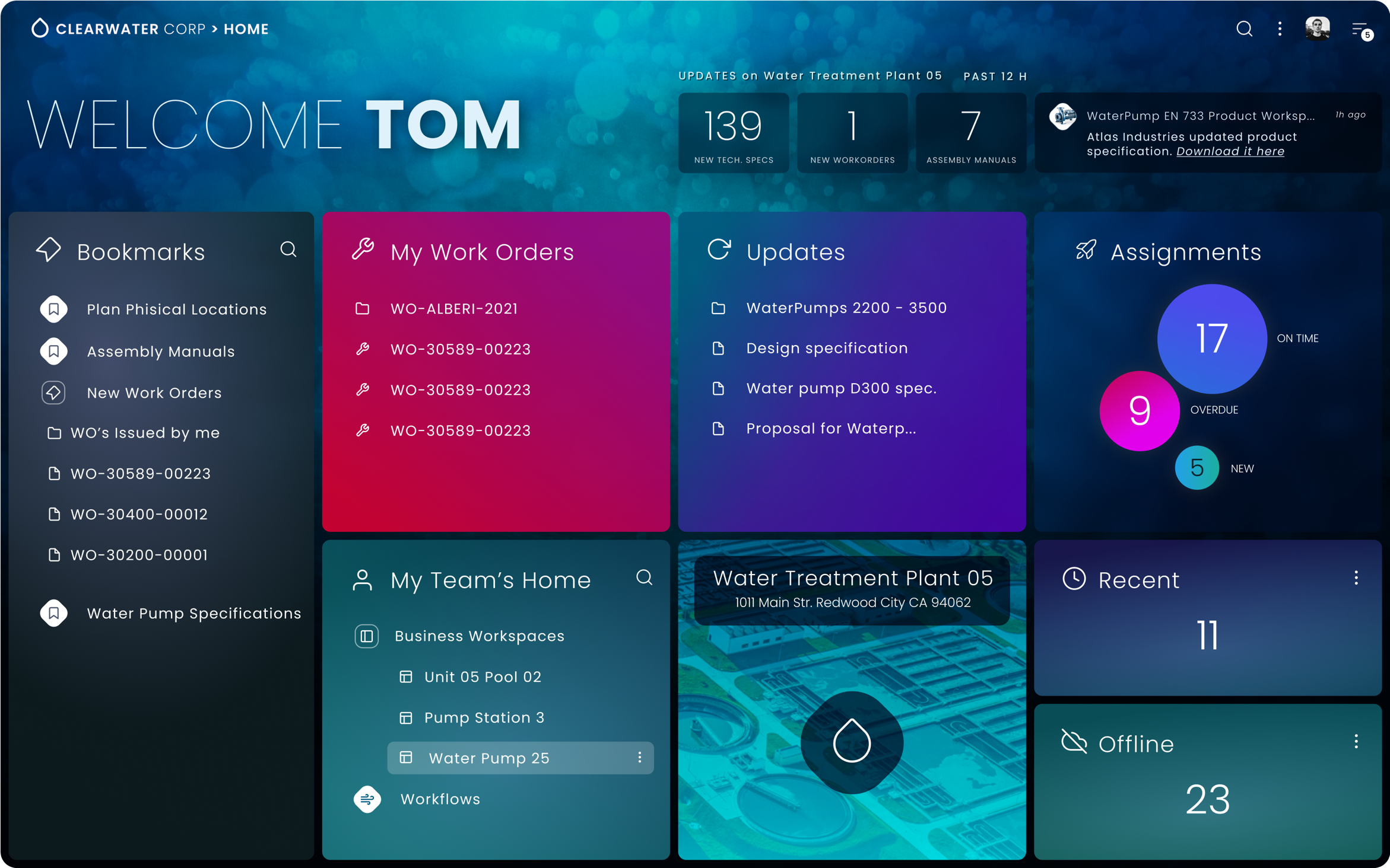
Users should not navigate or endlessly search a large enterprise system for content
The primary problem was with the old ECM UI, it required users to search or browse regardless. Whether they used the content frequently or not, each time they needed to find those common locations they worked with. There were obscured tools available, such as bookmarking, but it was hard and inflexible to just use it on the fly. So our idea was to create ROLES accessing certain content types and locations and just deliver them the appropriate content.
NEW: Progressive Disclosure vs. OLD: High Information Density
Original Content Server User Interface
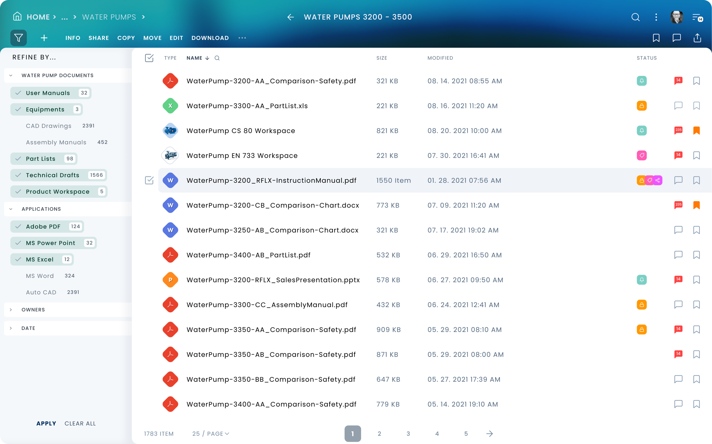
On demand actions and tools
On the old UI every action and tools such as the filter panel, were available at all times, even if there was no use for them. On the new UI, a user is only exposed to actions, options, tools whenever it is meaningful and usable. If nothing is selected in a table, no actions are available to operate on the content. Once a selection is made, only the appropriate actions become available relative to the selected type item(s).
Progressive (Information) Disclosure
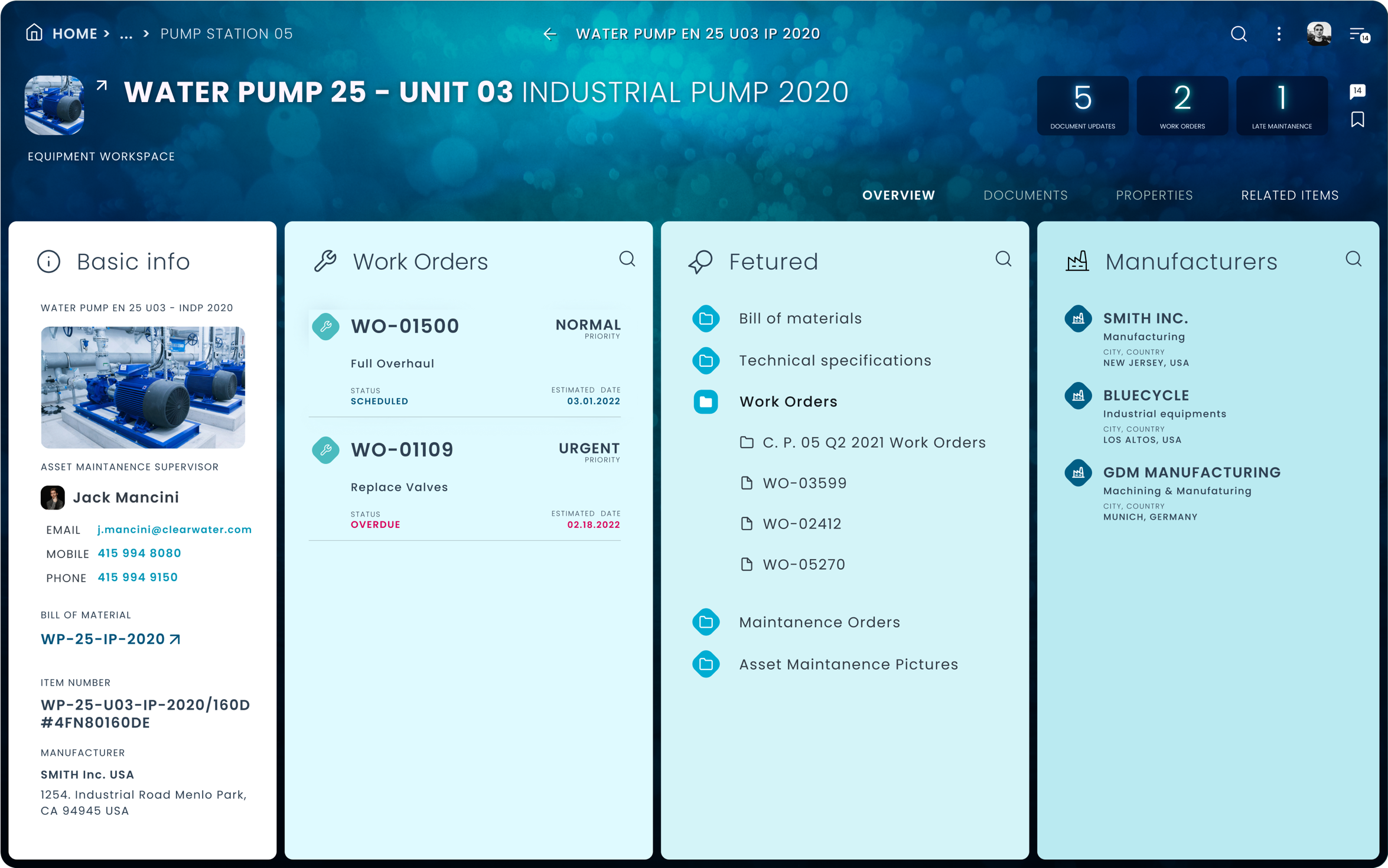
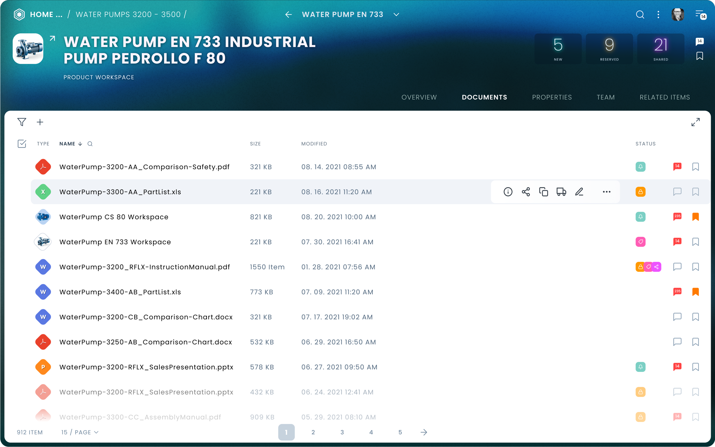
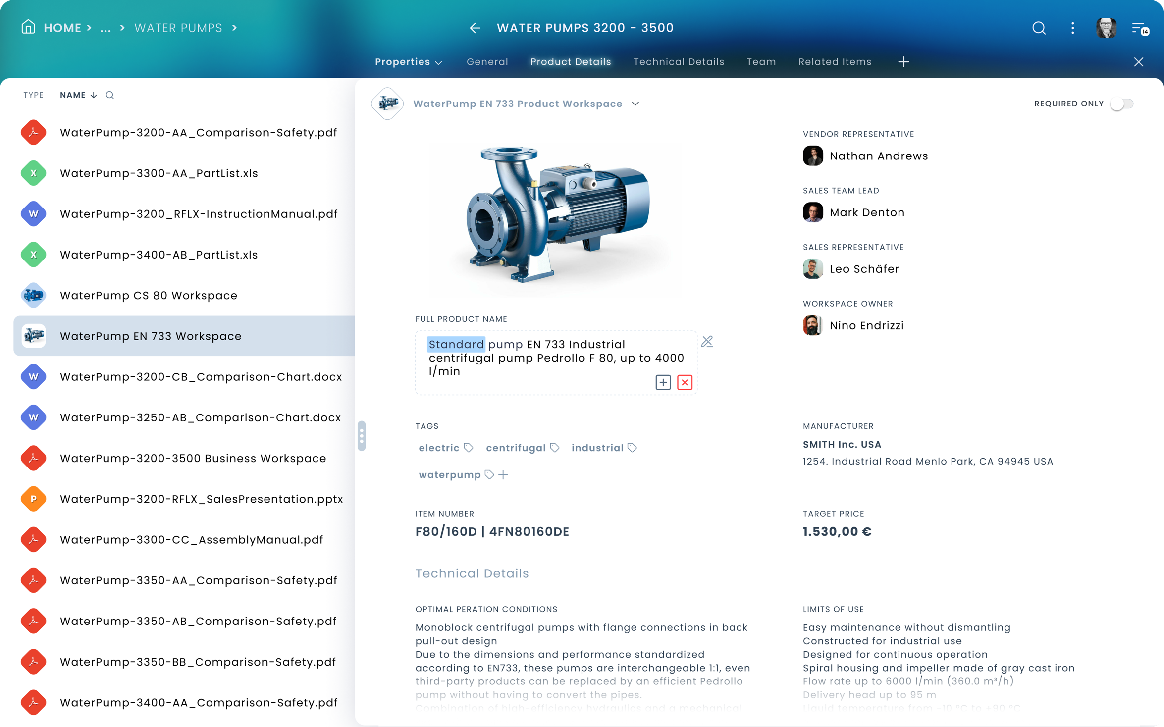
Business Workspace
Business Workspaces in the xECM system contain a large amount of Meta-Data, different types of documents, internal and external linkage, and other content.
This is a huge amount of information a user cannot effectively process at once. So we created a Multi-Faceted UI layout representing a business workspace.
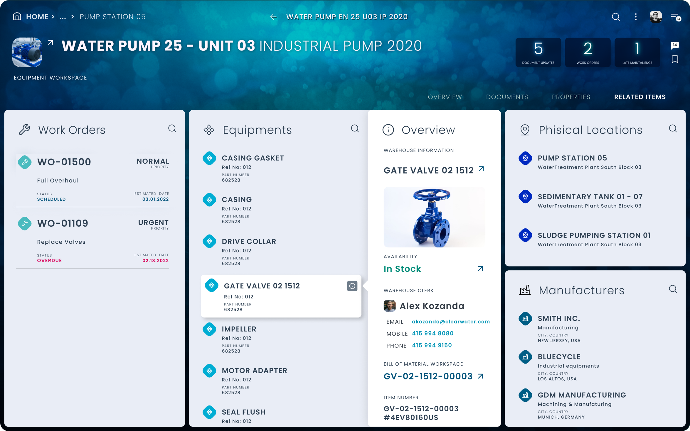
When a visitor arrives at a workspace, first he/her only exposed to the “Overview” page. This provides a slice of each type of content or high-level information segment. If a user does not immediately find here what he/she was looking for, can proceed to the other specific areas of the workspace. (Documents, Properties, Related Items, Team, etc…) Also, a user does not have to navigate to find out top-level, key information about related items in a workspace, he/she can just get a quick overview about those related items by opening an inline overview panel…
Contextual, Streamlined Interactions
Contextual…
Whenever a user is hovering over an item, the inline menu is displayed showing only appropriate actions relative to the item in question. Also, not all available actions are displayed, only the most commonly used ones. The user can always get the full list of actions from the … More menu. Social and bookmarking actions are always exposed, in order to allow, quick operation.
Contextual, direct interaction with elements
It is a nice feeling when you don’t have to beat around the bush to just get something done. Don’t have to make roundtrips just to change the name of something…
When you don’t have to change views or navigate elsewhere just flip a knob… So there was a considerable effort invested to make every operation immediate, direct, and contextual. When a user looks up metadata, he/she does not lose context and can switch immediately to another item to see metadata for that one. Also, every data segment can be edited in place without saving it with inline validation. The Metadata form can be also edited on the fly just by deleting or adding a new section to it once the block is in edit mode.
Direct and snappy…
Users do not have to open up an item just to change one or the other properties or commit action on it. For instance, a user can just casually reassign approvers for a workflow list item if it is necessary, meaning if the workflow in question is late…
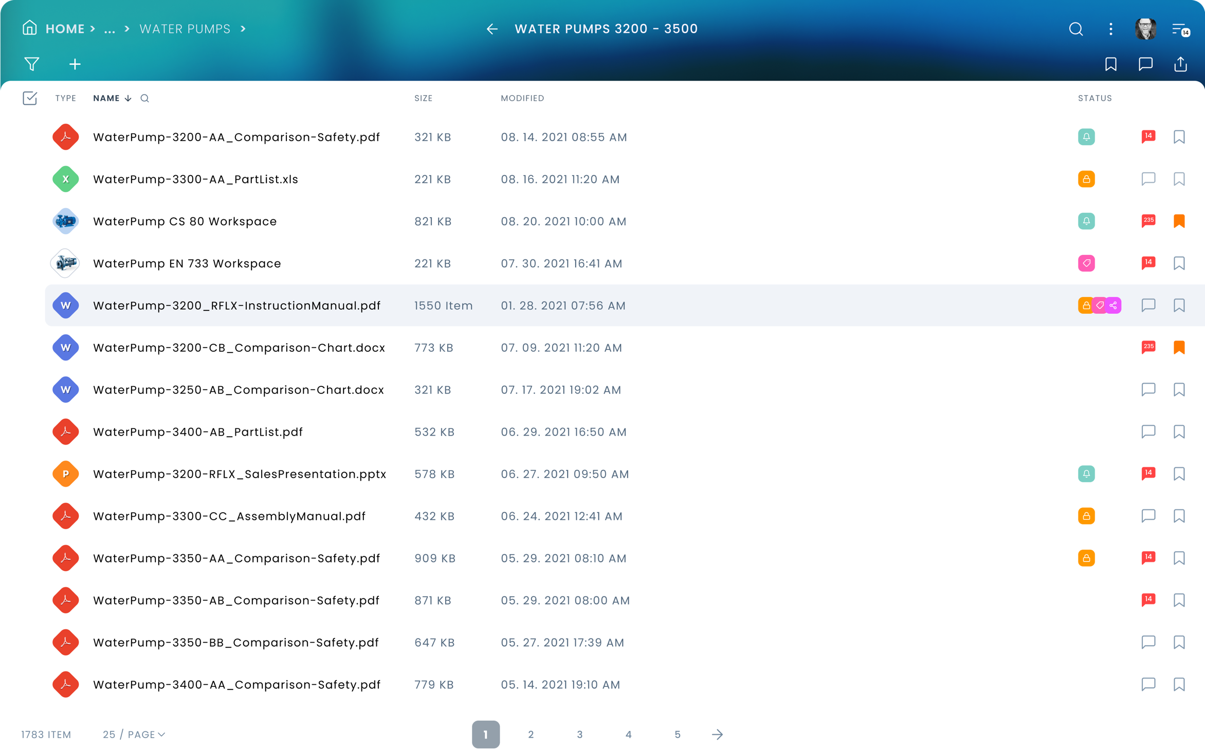
Moving Items
File Browser: Pick Item from Or Copy, Move Items to…
One of the basic tools for efficient content operations is a file browser, part of every OS’s and system dealing with documents and objects.
The sliding, double pane file browser modal window was designed to keep users in context and to be able to access the entire system with little effort.
The top location selector lets users quickly reach common or frequently used, bookmarked locations, etc… By default always the entire right-hand side pane is the select target location. This component was designed for bulk and single item pick, copy, move operations. Local move operations in the currently viewed directory can be just completed by simple drag & drop action.


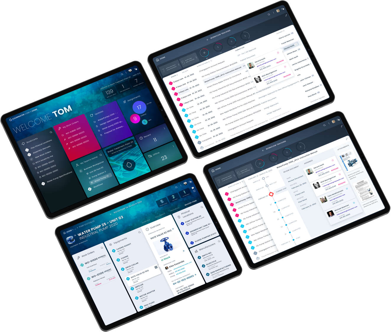
Example for Tracking Workflows Use Case
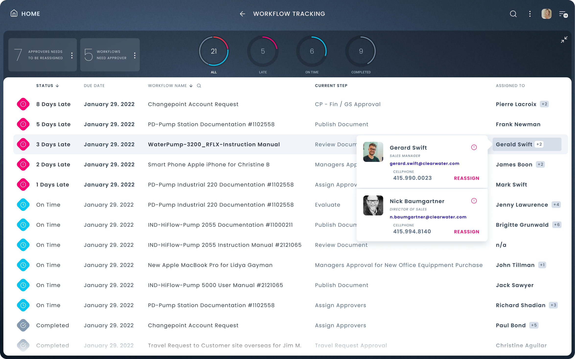
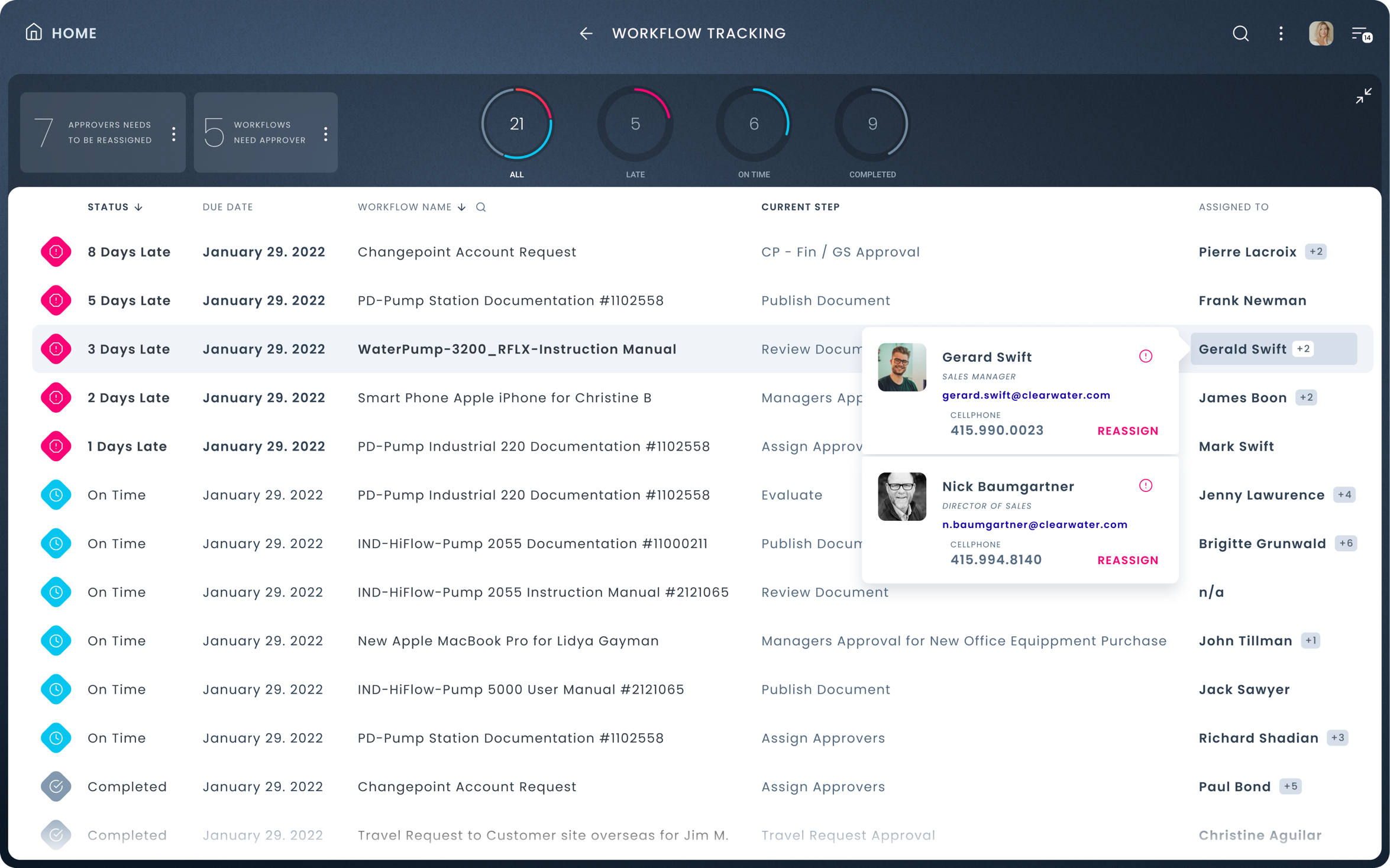
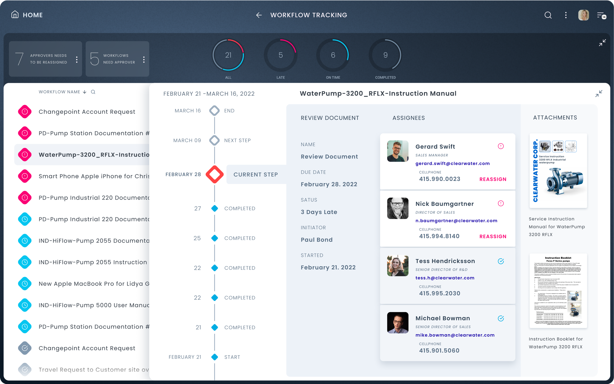
Making sure, workflows are on time…
Catherine took the responsibility to make sure workflows are on time in her organization. Her (Role-based) Landing page contains a tile (Workflow Tracking) allowing her to control workflows. The tile shows all the Late items that require her attention. She clicks on the tile to maximize it. She can see there all the currently running and recently (this week) completed workflows.
Workflow Tracking List view
The maximized tile displays all workflows with the late ones on top. Also in the list view header, there is a display showing how many workflows lack assignees and how many assignees need to be re-assign due to unavailability. Also, there is an overview about the state of all workflows: how many are in total, late, on time, and completed. Catherine can just hover over the assigned column in the list view and see who can be or needs to be reassigned on individual line items.
She also can click on the workflow name to see the details concerning each workflow.
Workflow Tracking Progress View
Catherine opened one of the workflows to check at which step the workflow got stuck and read some details regarding the workflow. She sees two people who did not complete their assignments. She can either contact those or she can just reassign the task to some other available colleague.

Copyright © 2022 Peter Budavari. All rights reserved.